Color Theory for Fashion: Choose Flattering Colors for Your Skin Tone
Anúncios
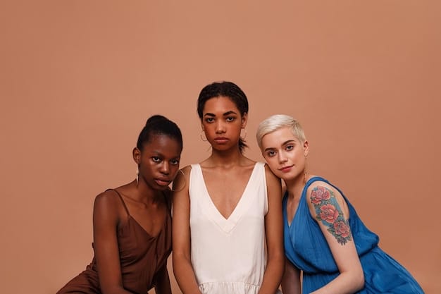
Color Theory for Fashion: How to Choose the Most Flattering Colors for Your Skin Tone involves understanding your skin’s undertones—warm, cool, or neutral—to select hues that naturally enhance your complexion and wardrobe, moving beyond basic color preferences for a more harmonious aesthetic.
Ever wondered why some outfits make you glow, while others just fall flat? The secret often lies in understanding Color Theory for Fashion: How to Choose the Most Flattering Colors for Your Skin Tone. It’s more than just picking your favorite shades; it’s about harmonizing your clothing choices with your unique complexion. This guide will help you decode the intricate relationship between color and skin tone, transforming your wardrobe and elevating your personal style.
Understanding Undertones: The Foundation of Flattering Colors
Before diving into specific colors, it’s crucial to understand your skin’s undertone. This isn’t about the surface color of your skin, which can change with sun exposure, but rather the subtle hue beneath the surface. Identifying your undertone—warm, cool, or neutral—is the most critical step in applying color theory to your fashion choices.
Many people mistakenly focus on their surface skin color, leading to clothing choices that can sometimes clash rather than complement. The true magic happens when your clothing’s undertones align with your natural skin undertones, creating a balanced and radiant look. This foundation is essential for anyone looking to truly master their personal style.
Identifying Your Undertone: Simple Tests
Determining your undertone can be surprisingly simple with a few quick tests that don’t require any special tools. These methods are designed to reveal the underlying hues of your skin, offering clear guidance for your fashion decisions. Pay close attention to the subtle differences as you conduct each test.
- The Vein Test: Look at the veins on your wrist in natural light. If they appear blue or purple, you likely have cool undertones. If they look green, your undertones are warm. If you can’t quite tell, or they seem to be a mix of both, you might have neutral undertones. This simple observation can provide significant insight into your skin’s natural leanings.
- The Jewelry Test: Consider which type of jewelry seems to enhance your skin more. If silver jewelry makes your skin appear more vibrant and healthy, you probably have cool undertones. If gold jewelry brings out a glow in your skin, you’re likely working with warm undertones. If both look equally good, you’re probably neutral.
- The White Paper Test: Hold a piece of pure white paper next to your bare face in natural light. If your skin appears pinker, rosy, or blueish against the white, you have cool undertones. If it looks more yellow, peachy, or golden, your undertones are warm. If you see a mix, or no obvious lean, neutral is your category.
Each of these tests offers a different perspective, and it’s often helpful to try all of them to get a comprehensive understanding. The more consistent the results, the clearer your undertone category will be. This initial assessment is the cornerstone of building a truly flattering wardrobe.
Once you’ve identified your undertone, a whole new world of color possibilities opens up. This understanding allows you to move beyond simply what colors you like and into what colors truly make you shine. It’s about creating a harmonious visual narrative with your clothing and enhancing your natural beauty. This foundational knowledge will guide all subsequent color selections.
Colors for Warm Undertones: Radiance and Earthy Tones
If your skin has warm undertones, you’ll find that certain colors naturally enhance your complexion, bringing out a healthy, radiant glow. These colors often reflect the warmth found in nature, from sunny landscapes to rich earth tones. Embracing these hues will make your skin look vibrant and your features more defined.
The key to dressing with warm undertones is to select colors that reflect the golden, peachy, or yellow tints in your skin. These shades will not only complement your natural warmth but also prevent your skin from looking sallow or washed out. Think of colors that feel cozy and inviting, similar to a sunset or autumn leaves.
Best Colors for Warm Undertones
Colors that mimic the rich, inviting hues of nature tend to look best on individuals with warm undertones. Golds, olives, and warm reds can make your skin pop, enhancing its natural luminosity. These colors create a harmonious flow, making your entire look feel cohesive and intentional.
- Earth Tones: Shades like olive green, moss green, terra cotta, camel, cream, and rich browns resonate beautifully with warm undertones. These colors often have a natural, grounding effect, making them perfect for everyday wear and sophisticated ensembles.
- Warm Reds and Oranges: Tomato red, coral, peach, and burnt orange are incredibly flattering. These vibrant hues pull out the golden tones in your skin, making you appear more lively and energetic. They add a touch of warmth that is both inviting and stylish.
- Golden Yellows: Mustard yellow, corn yellow, and true gold complement warm undertones by mirroring their natural luminosity. These colors can brighten your face and add a cheerful element to your wardrobe, especially during warmer months or to combat cooler climates.
- Jewel Tones (Warm): While jewel tones are often associated with cool complexions, certain warm versions, like marigold or deep teal, can work. It’s about the specific warmth within the hue. Look for jewel tones that lean more yellow or brown to ensure they complement your skin.
When selecting garments, consider the fabric’s texture and how it interacts with the color. For instance, a rich, warm brown in a cashmere sweater will feel different than the same shade in a crisp linen. Both can be flattering, but the overall effect will vary. Experimentation is key to finding what truly resonates with your personal style.
Beyond clothing, consider applying these color principles to your accessories and makeup. Gold jewelry, for example, will typically enhance warm undertones more than silver. Similarly, makeup shades with warm undertones, such as peach blushes or golden highlighters, will complete your look, ensuring a cohesive and radiant appearance.
Colors for Cool Undertones: Crispness and Cool Clarity
For those with cool undertones, colors with a blue or pink base will illuminate your complexion, making it appear fresh and clear. These shades often reflect the cool, crisp tones found in skies, oceans, and winter landscapes, bringing out a natural brilliance in your skin.
The aim when dressing with cool undertones is to select colors that complement the subtle pink, blue, or red tints in your skin. These hues will prevent your skin from looking flushed or overly pale, instead providing a clean and vibrant backdrop. Think of colors that evoke a sense of calm and clarity, like a clear winter day or a deep blue sea.
Best Colors for Cool Undertones
Colors that echo the cool side of the spectrum—blues, purples, and certain greens—are typically most flattering for individuals with cool undertones. These shades create a harmonious contrast that highlights your skin’s natural coolness, leading to a polished and refined aesthetic.
- Blues: From navy and royal blue to sky blue and ice blue, virtually all shades of blue are excellent choices. Blues complement the cool tones in your skin, enhancing its natural clarity and making your features pop. They are versatile and can be dressed up or down.
- Greens: Emerald green, forest green, jade, and mint green are particularly strong. These greens, which typically have a blue base, bring out the cool undertones in your skin, making it look vibrant and fresh. Avoid overly yellow-based greens that might clash.
- Pinks and Purples: Fuchsia, lavender, plum, and rose pink are incredibly flattering. These colors echo the natural rosiness in cool-toned skin, creating a delicate yet striking appearance. They can add a soft glow or a bold statement depending on the shade.
- Cool Reds: Unlike warm reds, cool reds (those with a blue base) like cherry red, burgundy, and cranberry are perfect. These shades lift your complexion, avoiding any redness or dullness that warm reds might cause. They add intensity and sophistication.
When choosing fabrics, consider how the material holds color. Smooth, crisp fabrics like silk or crisp cotton often present cool colors beautifully, enhancing their sharp, clear qualities. On the other hand, softer textures might diffuse the color slightly, creating a more muted effect. Both can be effective, depending on the desired outcome.
Just as with warm undertones, extending these principles to accessories and makeup can significantly enhance your overall look. Silver jewelry is often more flattering for cool undertones compared to gold. For makeup, cool-toned blushes and eyeshadows will complement your complexion, ensuring a harmonious and elegant appeal. It’s all about creating visual cohesion.
Colors for Neutral Undertones: The Best of Both Worlds
Individuals with neutral undertones have the unique advantage of being able to wear a broader spectrum of colors with ease. Your skin exhibits a balanced mix of warm and cool tones, allowing for incredible versatility in your wardrobe. This balanced complexion acts as a versatile canvas, accepting a wide array of hues without clashing.
The beauty of neutral undertones is that you are less restricted by the “warm vs. cool” dilemma. While you can lean into either warm or cool palettes, you’ll often find that medium-intensity colors, or those that bridge the gap between warm and cool, are particularly successful. This flexibility offers an expansive playground for fashion experimentation.
Best Colors for Neutral Undertones
Neutral undertones are incredibly adaptable, allowing you to experiment with a vast array of colors. The most flattering shades often fall in the middle ground, avoiding extremes of either warm or cool intensity. These versatile hues highlight your balanced complexion, providing a sophisticated and adaptable wardrobe.
- Mid-tone Colors: Colors like true red, medium blue, jade green, and soft rose tend to look phenomenal. These shades are neither aggressively warm nor overtly cool, making them harmonious with a neutral base. They offer a refined balance that simply works.
- Neutrals with a Hint: Classic neutrals like true gray, off-white (not too creamy, not too stark), light camel, and charcoal will always be reliable. These colors serve as excellent foundations, allowing you to add pops of color from either warm or cool palettes, depending on your mood or the occasion.
- Balanced Blues and Greens: While pure blues and greens from both warm and cool sides can work, shades like teal (a mix of blue and green), periwinkle, and sage green are particularly complementary. They bridge the gap, offering a versatile range that suits your balanced skin.
- Dusty and Muted Tones: Muted versions of almost any color can be flattering. Think dusty rose, muted lavender, or softened olive. These less saturated versions prevent any single undertone from dominating, allowing your natural balance to shine through.
When building a wardrobe around neutral undertones, consider layering and mixing textures. A neutral base allows for bolder accessory choices or a mix of warm and cool patterns within a single outfit. Your complexion provides the perfect backdrop for creative and diverse styling.
For accessories and makeup, you have considerable freedom. Both gold and silver jewelry can work well, so choose based on personal preference or the color scheme of your outfit. When it comes to makeup, you can experiment more broadly, opting for peach blushes one day and rosy tones the next. This adaptability is truly a fashion blessing for those with neutral undertones.
Seasonal Color Analysis: A Deeper Dive into Personal Palettes
While understanding your undertone is a powerful start, seasonal color analysis takes it a step further. This method categorizes individuals into one of four or twelve “seasons” based on a combination of skin undertone, hair color, and eye color. It provides a more nuanced and detailed palette for your wardrobe, often leading to even more precise and flattering choices.
Seasonal analysis builds upon the foundation of warm and cool undertones, adding dimensions of clarity, depth, and chroma (intensity) of your natural coloring. By pinpointing your specific season (e.g., “True Autumn” or “Cool Summer”), you gain a curated selection of colors that not only complement your skin but also your hair and eye color, creating a complete harmonious look.
The Four Main Seasons
The traditional seasonal analysis divides individuals into four main categories, each with its own defining characteristics and optimal color palette. Understanding these broad categories is the first step toward refining your personal color journey.
- Spring: Typically warm undertones, light hair (often golden blonde, strawberry blonde, light brown), and light eyes (blue, green, hazel). Spring types thrive in clear, warm, light, and bright colors. Think soft yellows, peach, coral, and clear greens.
- Summer: Cool undertones, light to medium hair (ash blonde, light to medium brown), and light to medium eyes (blue, gray, hazel). Summer types look best in soft, cool, and muted colors. Pastel blues, dusty rose, lavender, and soft grey are ideal.
- Autumn: Warm undertones, medium to dark hair (red, auburn, golden brown, dark brown), and warm or deep eyes (hazel, brown, green). Autumn types shine in rich, warm, muted, and deep colors. Think olive green, rust, mustard yellow, and deep cranberry.
- Winter: Cool undertones, dark hair (black, dark brown, ash brown), and deep or clear bright eyes (black, dark brown, clear blue/green). Winter types are best suited for clear, cool, bright, and deep colors. True white, black, royal blue, emerald green, and true red are excellent.
These four broad categories serve as a starting point. Within each season, further subdivisions (such as “True,” “Light,” “Bright,” “Soft,” “Deep,” and “Cool”) exist to provide even more precise color guidance, reflecting subtle variations in individual coloring.
While some find the full seasonal analysis overwhelming, even a basic understanding can significantly refine your color choices. It helps you move beyond just “warm” or “cool” and consider how the depth and intensity of a color interact with your overall appearance. Investing time in this analysis can truly transform your approach to fashion and personal presentation.
Beyond Undertones: Considering Contrast and Intensity
While undertones are paramount, understanding how contrast and intensity play a role in your overall aesthetic can further refine your fashion choices. These elements refer to how much your hair, skin, and eyes differ in lightness or darkness, and how vibrant or muted your natural features are. Integrating these factors ensures your outfits feel balanced and highlight your best features.
Many people overlook contrast and intensity, assuming that simply choosing the right undertone is enough. However, a high-contrast individual might be overwhelmed by soft, muted colors, even if the undertone is correct. Conversely, a low-contrast person might appear washed out in very bold, intense shades. It’s about creating a harmonious visual flow.
High, Medium, and Low Contrast
The level of contrast in your features—the difference between your hair, skin, and eye color—significantly impacts which colors and patterns will look best on you. Recognizing your contrast level helps you choose fabrics and combinations that enhance, rather than detract from, your natural appearance.
- High Contrast: Characterized by a significant difference between hair, skin, and eye color (e.g., very dark hair, very light skin, bright eyes). People with high contrast look stunning in bold, contrasting color combinations, like black and white, or deep jewel tones against light backgrounds. Patterns with clear, defined lines also work well.
- Medium Contrast: Features have a moderate difference in lightness/darkness (e.g., medium brown hair, medium skin, medium eyes). Individuals with medium contrast have more flexibility. They can pull off monochromatic looks, tonal dressing, as well as moderate contrasts. They look balanced in mid-range colors and patterns that aren’t too stark or too muddy.
- Low Contrast: Features are similar in lightness/darkness (e.g., light hair, light skin, light eyes, or dark hair, dark skin, dark eyes without much variation). Soft, blended, and muted colors work best. Monochromatic or analogous color schemes (colors next to each other on the color wheel) are particularly flattering, as are subtle patterns.
Understanding your inherent contrast can guide you not only in color selection but also in choosing prints and patterns. High-contrast individuals can confidently wear large, graphic prints, while low-contrast individuals might opt for smaller, more delicate patterns or textured fabrics that add visual interest without sharp distinctions.
Similarly, the intensity of your natural coloring—how bright or muted your eyes, hair, and skin appear—influences the vibrancy of colors you can wear. A naturally vibrant person can handle bold, saturated colors, whereas a naturally softer person might be better served by more subdued or dusty hues. This nuanced approach to color ensures that your clothing truly complements your unique features.
Navigating Common Fashion Color Mistakes
Even with a solid grasp of color theory and undertones, it’s easy to make common mistakes that can detract from your overall look. Recognizing these pitfalls and learning how to avoid them can significantly improve your fashion choices. It’s about being mindful and adjusting your approach as you continue to refine your style.
One frequent error is blindly following trends without considering how they align with one’s personal coloring. Just because a color is popular doesn’t mean it will be flattering. Another mistake involves sticking to a limited palette out of fear, missing out on many shades that could truly enhance your appearance.
Avoiding Unflattering Choices
Making informed decisions about color requires more than just knowing your undertone; it requires an awareness of how different shades interact with your specific features. Here are some common missteps and how to navigate them effectively, ensuring your wardrobe always serves to enhance your natural beauty.
- Ignoring Undertones: The most fundamental mistake is wearing colors that clash with your undertones. For instance, a cool-toned person wearing a very warm, orangey-red might look sallow or flushed, while a warm-toned person in a stark ice blue could appear washed out. Always prioritize your undertone as the primary filter for color choice.
- Over-reliance on “Safe” Colors: Sticking exclusively to black, white, and grey can be a safe bet, but it can also be limiting. While these neutrals have their place, relying on them too heavily prevents you from discovering colors that truly make you shine. Neutral undertones might find true white too stark or black too harsh near the face; sometimes off-white or charcoal grey are better choices.
- Misinterpreting Skin Tone vs. Undertone: Confusing the surface color of your skin with its underlying undertone is a common error. Someone with dark skin can have cool undertones, and someone with fair skin can have warm ones. The surface color is just one layer; the undertone is the foundation for color selection.
- Forgetting About Contrast: As discussed, neglecting your natural contrast level can lead to outfits that overpower or underwhelm your features. A low-contrast individual in a high-contrast outfit can look disjointed, while a high-contrast person in a monochromatic, low-contrast look might appear bland.
- Not Experimenting: The biggest mistake is being afraid to try new colors or combinations. Color theory provides guidelines, not rigid rules. Sometimes, a color that theoretically “shouldn’t” work might surprise you, especially when paired with the right accessories or in a specific fabric.
To avoid these pitfalls, approach color selection with an open mind and a critical eye. When trying on clothes, observe how the color makes your skin appear. Does it brighten your face, or does it make you look tired or sallow? Pay attention to the subtle shifts, and trust your intuition as you explore different shades.
Remember that lighting conditions can also impact how colors appear. Always try to assess colors in natural light rather than harsh artificial lighting, which can distort true hues. By being mindful of these common mistakes, you can refine your style and ensure your wardrobe consistently flatters your unique coloring.
Building a Flattering Wardrobe: Practical Steps
Armed with knowledge of your undertones, contrast, and intensity, you’re ready to start building a truly flattering wardrobe. This isn’t about throwing out everything you own, but rather making conscious choices about new purchases and learning to style what you already have more effectively. It’s an ongoing journey of refinement and personal expression.
The goal is to create a wardrobe where every piece works in harmony with your natural coloring, making getting dressed a joy rather than a challenge. This approach prioritizes thoughtful accumulation over impulsive buying, leading to more versatile and impactful outfits that truly reflect your best self.
Integrating Color Theory into Your Shopping Habits
Transitioning from theory to practice is where the real transformation happens. By consciously applying color principles to your shopping habits and existing wardrobe, you can cultivate a collection of clothes that consistently makes you look and feel your best. This strategic approach ensures every addition is a wise investment.
- Start with Your Neutrals: Begin by filling your wardrobe with neutral colors that flatter your undertone. For warm undertones, think camel, cream, and warm browns. For cool undertones, opt for charcoal, true grey, and crisp white. Neutrals form the backbone of any versatile wardrobe, allowing you to easily mix and match.
- Invest in Your Best Colors: Once your neutral foundation is solid, slowly add pieces in your most flattering accent colors. Focus on tops, scarves, and accessories that are worn close to your face, as these have the most direct impact on your complexion. These pieces should make your skin, hair, and eyes truly pop.
- Consider Fabric and Texture: The way a color appears can vary significantly depending on the fabric it’s rendered in. A rich jewel tone in silk will have a different effect than the same color in a matte cotton. Experiment with different textures and materials to see how they interact with your complementary colors.
- Build a Mood Board: Create a digital or physical mood board with images of clothing, accessories, and combinations that resonate with your personal color palette. This visual guide can help you stay focused during shopping trips and inspire new outfit ideas from your existing wardrobe.
- Don’t Be Afraid to Mix and Match: While knowing your best colors is important, don’t be afraid to mix in “less ideal” colors, especially if they are further away from your face (e.g., pants or shoes). You can always balance them with a flattering top or accessory.
Remember that fashion is also about personal expression. While color theory provides invaluable guidance, it should enhance your style, not restrict it. Use it as a tool to refine your choices, but always allow room for your unique preferences and evolving tastes. The most flattering wardrobe is one that makes you feel confident and comfortable in your own skin.
Conclusion
Understanding Color Theory for Fashion: How to Choose the Most Flattering Colors for Your Skin Tone is a transformative journey that moves beyond fleeting trends to unlock a truly personalized and harmonious style. By identifying your unique undertones, considering your natural contrast levels, and applying these insights, you can curate a wardrobe that consistently enhances your appearance and bolsters your confidence. This isn’t just about what looks “good” but what truly makes you shine, revealing the incredible power of color in personal presentation. Embrace this knowledge, experiment with new shades, and watch as your personal style blossoms into its most authentic and radiant form.
| Key Point | Brief Description |
|---|---|
| ✨ Undertone Importance | Identifying your skin’s undertone (warm, cool, neutral) is crucial for selecting colors that enhance your natural complexion. |
| 🎨 Color Palettes | Warm undertones suit earthy, golden hues; cool undertones benefit from blues, purples, and crisp tones; neutrals have broader versatility. |
| 📏 Contrast & Intensity | Consider the natural contrast of your features (hair, skin, eyes) to choose appropriate color combinations and patterns. |
| 🛍️ Practical Application | Build your wardrobe by starting with flattering neutrals, then adding accent colors, focusing on items closest to your face. |
Frequently Asked Questions About Color Theory for Fashion
To accurately determine your skin’s undertone, perform the vein test (blue/purple veins suggest cool, green veins suggest warm, mixed suggests neutral) and the jewelry test (silver for cool, gold for warm, both for neutral). The white paper test in natural light, observing if your skin appears pinkish or yellowish against it, can also help. Combining these methods usually provides a clear result.
Yes, absolutely! Color theory provides guidelines, not strict rules. If you love a color that’s not ideal for your undertone, you can wear it away from your face (e.g., in pants, skirts, or shoes). Alternatively, pair it with a flattering scarf or a top in your best neutral to balance its effect near your complexion.
“Neutral colors” typically refer to shades like black, white, gray, beige, brown, and navy. However, even these have undertones. For instance, a cool-toned white is crisp, while a warm-toned off-white is creamier. Choosing the right neutral depends on your personal undertone, ensuring even your basics are flattering.
Seasonal color analysis takes undertone a step further by combining it with your hair and eye color to place you into a specific “season” (Spring, Summer, Autumn, Winter). This provides a more nuanced palette that considers the overall depth, clarity, and intensity of your natural features, offering more precise color recommendations than undertone alone.
While wearing colors suggested by color theory will undeniably enhance your natural features, it’s not a rigid mandate. Fashion is also about personal preference and expressing your unique style. Use color theory as a guiding tool to make informed choices, but never let it stifle your creativity or restrict you from enjoying colors you genuinely love.
The journey to understanding Color Theory for Fashion: How to Choose the Most Flattering Colors for Your Skin Tone is a personalized exploration that promises to elevate your style and confidence. By diving deep into your skin’s unique undertones, you unlock a palette that resonates with your natural beauty, ensuring your clothing choices not only look good but also make you feel incredible. This foundational knowledge empowers you to build a wardrobe that is both aesthetically pleasing and authentically “you,” transforming routine dressing into an art form.


